OVER MY MANY YEARS AS AN ILLUSTRATOR, I’ve worked in just about every art medium except oil paints. Sometimes I chose a style or technique because it seemed right for a particular book. Other times I tried a new medium because I wanted to explore. Here are some of the highlights:
Watercolor Dry Brush
When I work in watercolor I always use a technique called “dry brush.” I start with a controlled version of the traditional wet washes, then render the details with layer upon layer of tiny brushstrokes. I keep a paper towel in my left hand for wiping excess paint off the brush each time I fill it with paint. Dry brush isn’t really dry, just not drippy wet.
I learned the technique in graduate school when I was studying medical illustration. I liked it because of the control it offered me, and I’ve always enjoyed working small with lots of detail. Petrosinella was the first book I did in watercolor dry brush–also my first full color book
(meaning I didn’t have to do separate overlays for each color). Others were The Conversation Club and A Country Tale.
Pen-and-ink With Pre-separated Overlays
I studied pen-and-ink in graduate school, too. I use it in the obvious way—for outlines and drawing in details. Then I add shadows and tones with crosshatching, in which thousands of tiny ink lines overlap each other to create the dark and middle-tone areas. As with watercolor dry brush, it’s a way of building up a complex design out of small, delicate, individual strokes. I used this technique for Little Orphant Annie and Jane Yolen’s Sleeping Ugly.
Once my pen-and-ink drawings were finished, I added soft color through “pre-separation.” That meant creating separate overlays on tracing paper for each of the colors in each illustration. These would later be used by the printer to make the printing plates. And though the overlays were done in black and white—in both cases I used pencil—what I’d drawn would eventually be printed in color.
Ink Resist With Overlays
This one is a little hard to describe, so bear with me. The base plate, or main drawing, was done with ink resist on good quality watercolor paper. I would first lay out the design using non-photo blue pencil (which is invisible to a camera photographing in black and white). Once I was happy with my drawing, I painted all the negative space (the background, where there wouldn’t be any lines) with a special kind of water-based white paint. When that was dry, I took a fat brush and covered everything with India ink and let it dry overnight.
Finally I took the whole thing over to the sink and ran water over it (this is why I needed good quality watercolor paper). India ink, once dry, doesn’t wash away—but the parts that were sitting on top of the protective paint did. The resulting black line looked a bit like a woodcut—crude in a really nice way. Of course, there were always a few mistakes, areas that didn’t “take,” or areas where I wanted to add some detail, so I went in and did touch-ups with pen-and-ink.
Now I needed to add the color. For every illustration I used three overlay sheets of thick vellum, one for each of the printers’ colors: cyan (a kind of turquoise blue), magenta (a kind of pinkish red), and yellow. Those three colors, plus black, can combine to produce virtually any color you could imagine. I painted the overlays in shades of gray, using photo-retouch paint. These paints come in numeric gradations from black to white and percentages in between. The overlays would then be photographed, made into printing plates, and printed in color. I only did this once, for Half-a-Ball-of-Kenki by Verna Aardema, but the results were wonderfully colorful and bright. They do not look remotely like pre-separated art. I must say I was very proud of myself.
Colored Pencil
I love working with colored pencils, but I only used them as my primary book medium one time, in Birdsong Lullaby. Unfortunately, I bought the wrong kind of paper to work on—soft printmaking paper. I chose it because I loved the look and feel of it. But no matter how much I bore down with my pencils, I couldn’t get crisp, dark lines or sharp contrast. This turned out to be a happy accident, because Birdsong Lullaby is a dreamy kind of story and the look I achieved was just right. In a few places where I needed more definition, I went in with colored inks and a very fine pen. And in places like the sky, I used Dr. Martin’s Dyes applied with an airbrush. Once again, this was a mistake. The dyes faded almost to white. But despite all the technical problems, I was pleased with the final result.
I have used colored pencil in a mixed-media way, especially when working in watercolor—to add subtle detail on a face, to warm up the green on a hillside, that kind of thing. It’s particularly good for faces and other things that need a smooth gradation of a subtle blush of color. When all else fails, I inevitably pull out the colored pencils.
Gouache
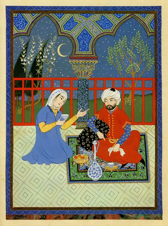
My favorite! Gouache (pronounced goo-wash) is an opaque watercolor, sometimes called “designer’s colors.” It allows you to get a flat, even, brilliant color. And unlike transparent watercolors, you can paint light over dark–as you can see in this Illustration from Fortune where the stars, flowers and leaves on the trees in the background are all painted over a dark sky. Gouache can be watered down for painting delicate details, like the fine linear pattern on the floor, the floral design on the rug, and the elaborate Persian designs on the architectural elements.
I have always tried to match my art style to the story I’m illustrating. Because this made-up fairy tale was set in ancient Persia, I I did a lot of research into Persian miniatures and painted in that style. I chose to work on a slick-surfaced paper with an old, weathered appearance, like the “foxing” you see in old books. It took paint beautifully and added a warmth to the unpainted areas. As in the old miniatures, I used black holding lines, made the figures static and decorative, rather than realistic, used brilliant color and lots of pattern. Because elaborate borders were part of the look, I collected a drawer-full of decorative papers and used them to create collage borders.
I loved painting in this technique and Fortune is one of my favorite books. Most of my biographies were done in gouache. Once discovered, it became my go-to medium.
Gouache With Transparent Watercolor, Colored Pencil, and Ink
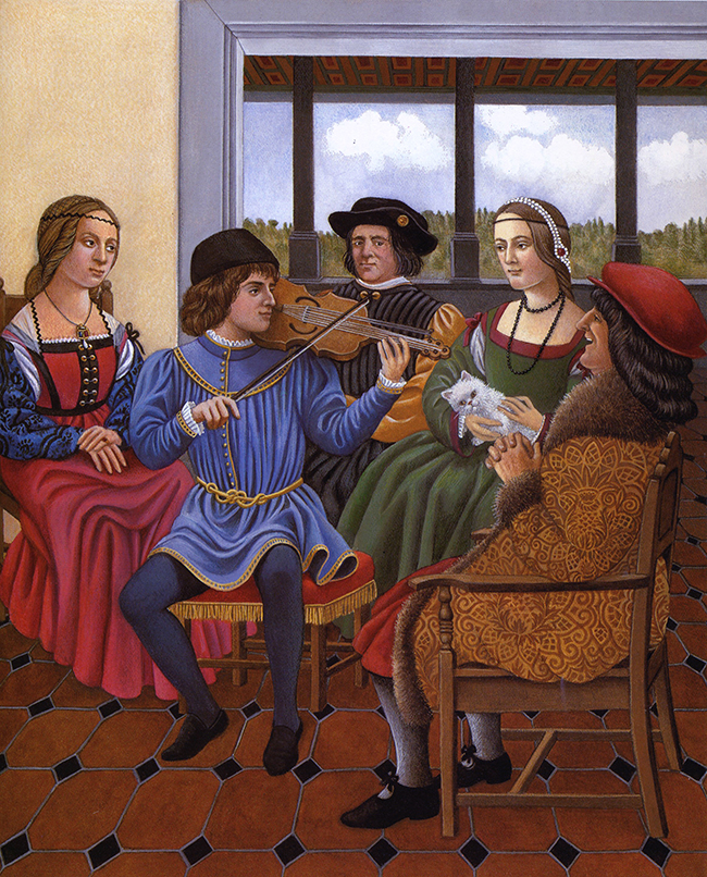
This is my multi-media combo of choice, seen here in Leonardo da Vinci. Much as I love gouache, it has a very graphic look, wonderful for a book like Fortune. But it doesn’t lend itself to delicate realism. For my book on Leonardo da Vinci, I really wanted a Renaissance feel, with a highly rendered and subtle look. So I went back to my old standby, watercolor dry brush, for delicate things like faces, then came in with gouache for bold color in costumes, walls, and patterns. Finally, I pulled out two other old friends–colored pencils to adjust tones and add texture and pen-and-ink for details.
A little of everything, whatever I needed at the time.
Starting with my first full-color books, virtually none of my illustrations were done in a single medium (with the exception of Joan of Arc, below, because acrylics, unlike water-based paints, don’t play well with other art media).
Over the years, the more art techniques I tried, the more I saw how they could be used together. These four media–gouache, transparent watercolor, colored pencil, and ink were the ones I always went back to.
Acrylics
I tried acrylics only once, with Joan of Arc, but the medium didn’t suit me. The paint had an unpleasant texture and it dried too fast. I chose it because I was searching for a technique that would move my art in the direction of Renaissance painting, without the slow-drying issue oil paints present (I subsequently found the holy grail with egg tempera, below).
This was a case where I should have done more research, because I’ve since learned that there are many ways of overcoming those problems and lots of really cool things you can do with acrylics. But I’d worked too long with water-based paints, and particularly loved the option of mixing a color and being able to use it again, even after it had dried on my palette. All I had to do was add a few drops of water, and I could use it again.
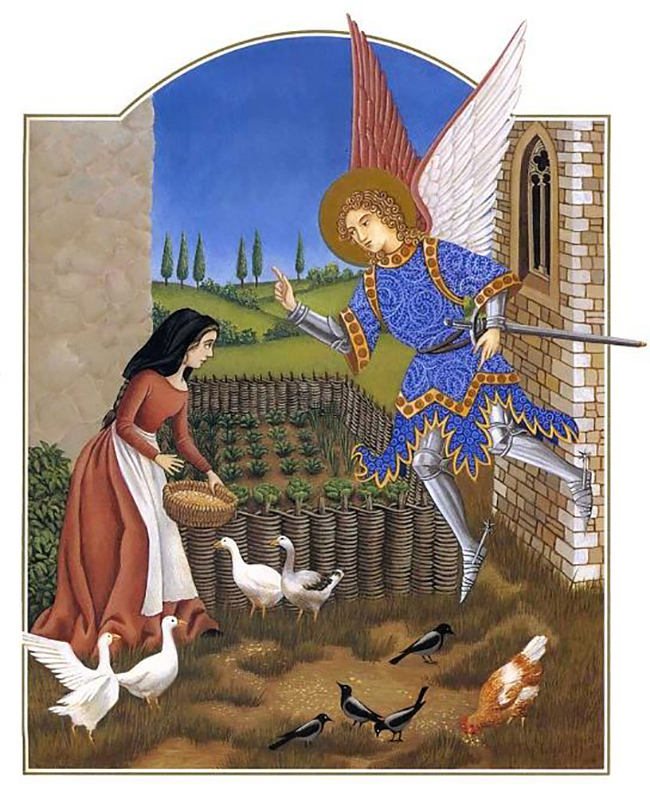
Because of the late Medieval setting for Joan of Arc, I used my collection of illuminated manuscript reproductions for inspiration. The arched border, for example, is a common design element in illuminated books, as is the convention of “breaking the border” as you see here with the angel’s wings and sword and the goose’s wing on the left. Since the word “illumination” referred to the use of real gold paint for decorative effect, I was thrilled when the publisher agreed to go the extra mile and add metallic “gold” ink as a fifth color.
Pastels
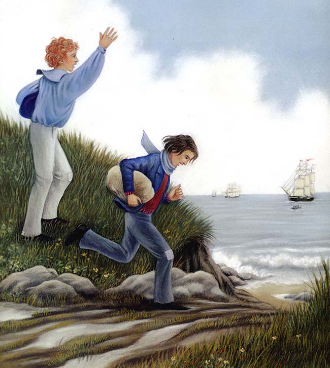
Ah, pastels! As with acrylics, I used them only once, for The True Adventure of Daniel Hall, but not because I didn’t like them. In fact, I loved the softness of the medium and the way I could smudge them with my fingers. And the colors are incredibly rich and beautiful. Fun, fun, fun!—except that they made an unholy mess of my studio (and of the artist as well).
Worse, pastels are fragile; touch them at your peril. (That means you, Mr. Printer-man in Hong Kong!) True, you can spray them with fixative, and that helps a bit, but fixative tends to darken the colors and the surface can still be smudged.
So I built foam-core boxes for each of the illustrations to protect them during shipping. The resulting pile of boxes was over two feet high. Imagine the postage! Then when they came back from the publisher after the book had been printed, I figured I’d either have to put a cloth over the pile and use it as a coffee table or give the art away. They’re now in the collection of the wonderful Mazza Museum at the University of Findlay. Thanks, Mazza—you have more space than I do.
Egg Tempera
Egg tempera (not to be confused with tempura, which is a Japanese batter for frying) is one of the oldest painting techniques in history. The Egyptians, Greeks, and Romans used it, as did the artists of the early Renaissance, such as Leonardo da Vinci. It went out of fashion when oil paint became the rage in the Renaissance, but it’s been making a comeback in the last hundred years.
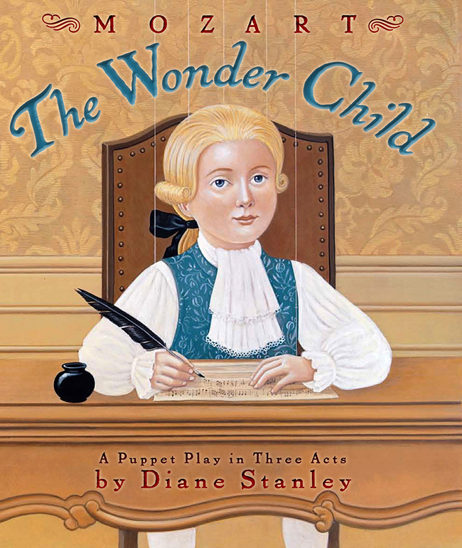
I learned the technique through a lot of study, and for several years it was my obsession. I went to England to work with an icon painter (icons are traditionally done in tempera) and took numerous workshops with a remarkable teacher, Koo Schadler. I did the illustrations for Mozart: The Wonder Child in egg tempera on gesso-treated Masonite.
Every morning I would make my own paint by mixing fresh egg yolk with water, then adding it to powdered color and grinding them together on a glass palette. The paint is then applied in glaze after glaze, giving a beautiful, transparent, delicate look and lots of control for detail. But it was an enormous amount of work for book art. And the boards for a 48-page book were so heavy I had to hand-carry them to New York in two suitcases. (I do seem to create these problems for myself, don’t I?) All the same, I loved painting that way, channeling my inner Leonardo.